Data visualization blocks
Introduction
blockr.ggplot provides interactive blocks for data visualization using ggplot2. Each block offers a user interface for creating and customizing visualizations. Blocks can be connected together to create sophisticated data visualization pipelines.
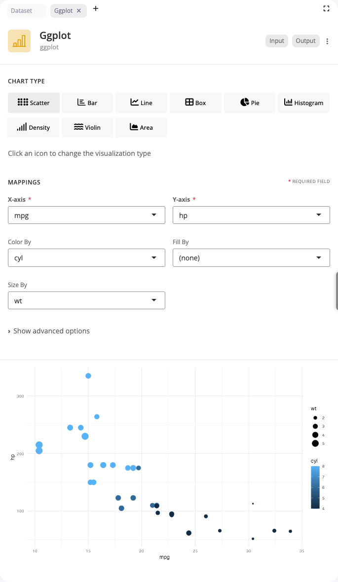
Scatter Plot
The ggplot block creates visualizations using ggplot2. For scatter plots, use the “point” chart type to display relationships between two continuous variables.
Map columns to the x and y axes to show how variables relate to each other. Add color and size aesthetics to encode additional variables. The color aesthetic uses categorical or continuous variables to assign colors to points, while size maps numeric values to point sizes. This is particularly effective for exploring correlations and patterns in multidimensional data.
Scatter plots support additional aesthetics including shape (for categorical distinctions) and alpha (transparency). Use alpha values between 0 and 1 to reduce overplotting in dense regions. The block automatically handles scale creation and legend generation for all mapped aesthetics.
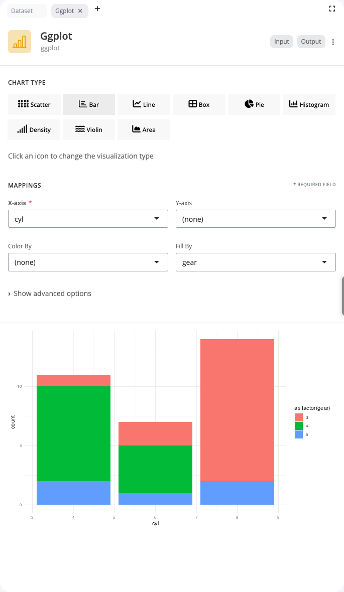
Bar Chart
Bar charts display categorical data with rectangular bars. Use the “bar” chart type to compare values across categories or show frequency distributions.
Select a categorical variable for the x axis to create bars for each category. The fill aesthetic adds color coding by another categorical variable, automatically creating stacked or grouped bars. Choose between position adjustments: “stack” (default) stacks bars on top of each other, “dodge” places bars side-by-side, and “fill” creates proportional stacked bars showing percentages.
Bar charts work well for comparing discrete groups, showing distributions of categorical variables, or displaying summary statistics. The block handles count aggregation automatically when no y variable is specified.
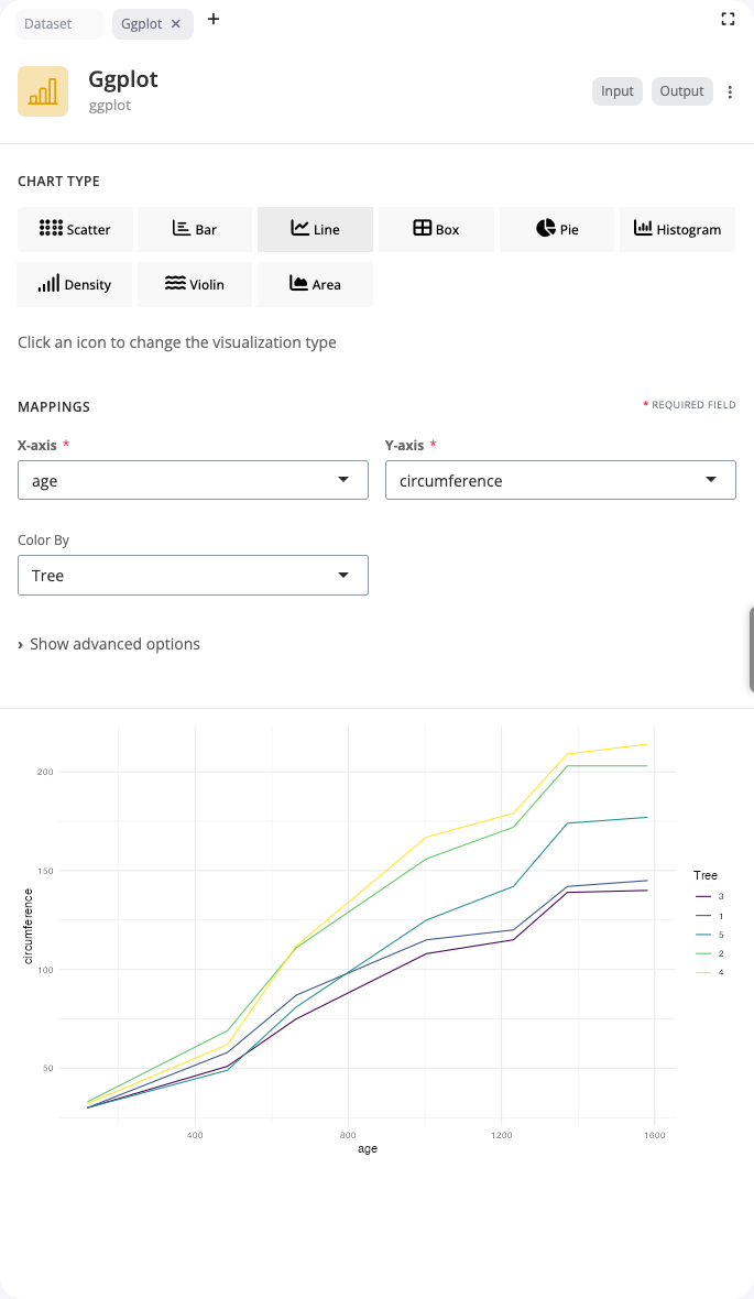
Line Chart
Line charts connect data points to show trends over time or across ordered categories. Use the “line” chart type for time series or sequential data.
Map a sequential variable (like time or age) to the x axis and a continuous variable to y. The color aesthetic creates separate lines for different groups, making it easy to compare trends across categories. Lines are automatically sorted by x values and grouped appropriately.
Line charts support additional aesthetics including linetype for distinguishing groups with different line styles (solid, dashed, dotted) and size for varying line thickness. This visualization is ideal for temporal data, growth curves, and tracking changes over ordered sequences.
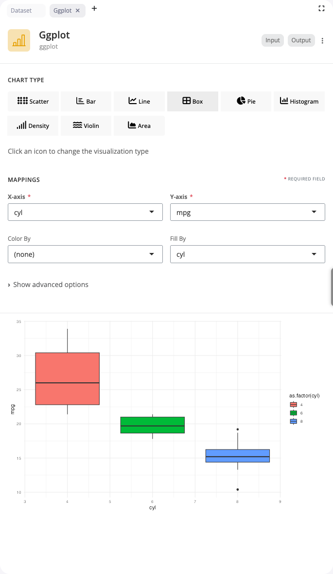
Box Plot
Box plots display the distribution of continuous data through quartiles. Use the “boxplot” chart type to compare distributions across groups or identify outliers.
Select a categorical variable for x and a continuous variable for y. The box shows the interquartile range (IQR) with a line at the median. Whiskers extend to the most extreme points within 1.5 × IQR from the box edges. Points beyond the whiskers are plotted individually as potential outliers. The fill aesthetic colors boxes by group.
Box plots provide a compact summary of distribution shape, central tendency, and variability. They’re particularly effective when comparing multiple groups side-by-side, as the aligned boxes make differences in median, spread, and skewness immediately visible.
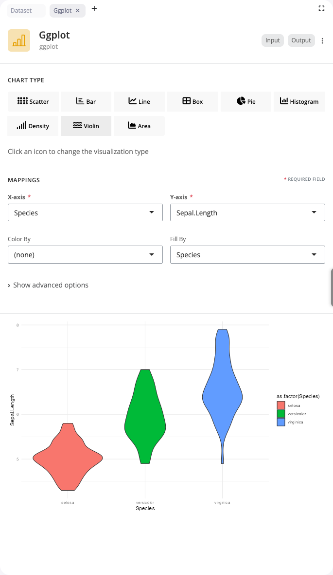
Violin Plot
Violin plots combine box plots with density plots to show the full distribution shape. Use the “violin” chart type when distribution shape matters as much as summary statistics.
Like box plots, violin plots require a categorical x variable and continuous y variable. The width of the violin at each y value represents the density (frequency) of data at that value. This reveals features like multimodality, skewness, and distribution tails that box plots obscure. The fill aesthetic colors violins by group for easy comparison.
Violin plots are superior to box plots when you need to see whether distributions are unimodal or multimodal, identify subtle differences in distribution shape, or understand the full data density rather than just quartiles. They’re especially valuable with larger datasets where distribution details matter.
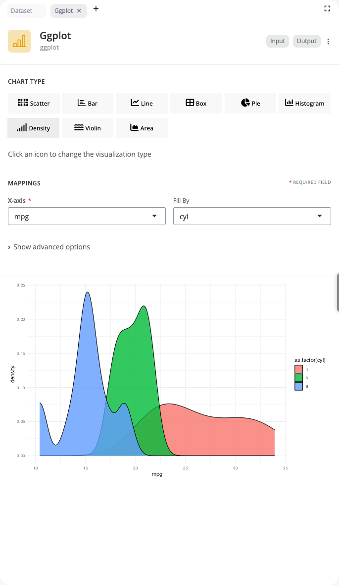
Density Plot
Density plots smooth histograms into continuous curves showing probability distributions. Use the “density” chart type to compare distributions across groups with overlapping curves.
Map a continuous variable to x to create a density curve. The fill aesthetic creates separate curves for different groups, with alpha transparency allowing curves to overlap visibly. Density estimation automatically handles bandwidth selection, though you can adjust smoothing if needed.
Density plots work well for comparing distributions when you want smooth, continuous representations rather than binned histograms. They’re particularly effective with the alpha aesthetic set to 0.5-0.7, which makes overlapping distributions easy to distinguish. Use them to compare distribution shapes, identify modes, or assess whether groups follow similar patterns.
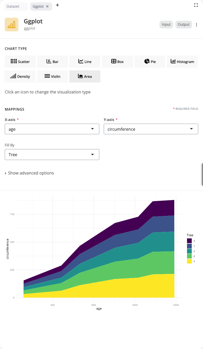
Area Chart
Area charts are filled line charts that emphasize cumulative magnitude over time. Use the “area” chart type to show how quantities accumulate or to emphasize the volume under curves.
Like line charts, area charts map sequential data to x and continuous values to y. The fill aesthetic creates separate colored areas for different groups. Areas can be stacked (showing cumulative totals) or overlapped with alpha transparency (showing individual contributions). This makes them ideal for part-to-whole relationships over time.
Area charts work best when the filled space has meaning, such as cumulative quantities, market shares, or resource allocation over time. The alpha aesthetic (0.6-0.8) is particularly important when comparing overlapping areas, as it allows all curves to remain visible while still emphasizing volume.
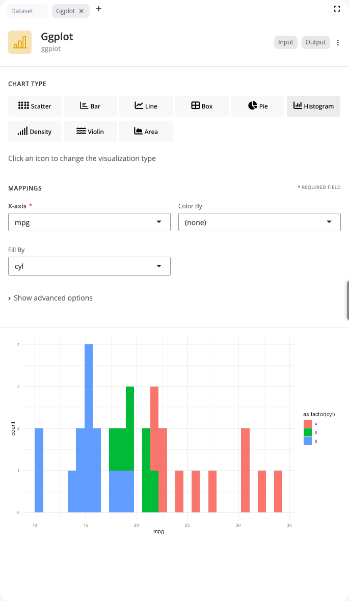
Histogram
Histograms bin continuous data to show frequency distributions. Use the “histogram” chart type to understand the shape, center, and spread of a single variable.
Select a continuous variable for x. The block automatically creates bins and counts observations in each bin. The bins parameter controls the number of bins (default: 30) - fewer bins show general patterns, more bins reveal details. The fill aesthetic colors bars by groups, with position options controlling whether bars stack or dodge.
Histograms are fundamental for exploratory data analysis: assessing whether data follows a normal distribution, identifying skewness or multimodality, detecting outliers, and understanding data range. Experiment with bin counts to find the right level of detail for your data’s density and range.
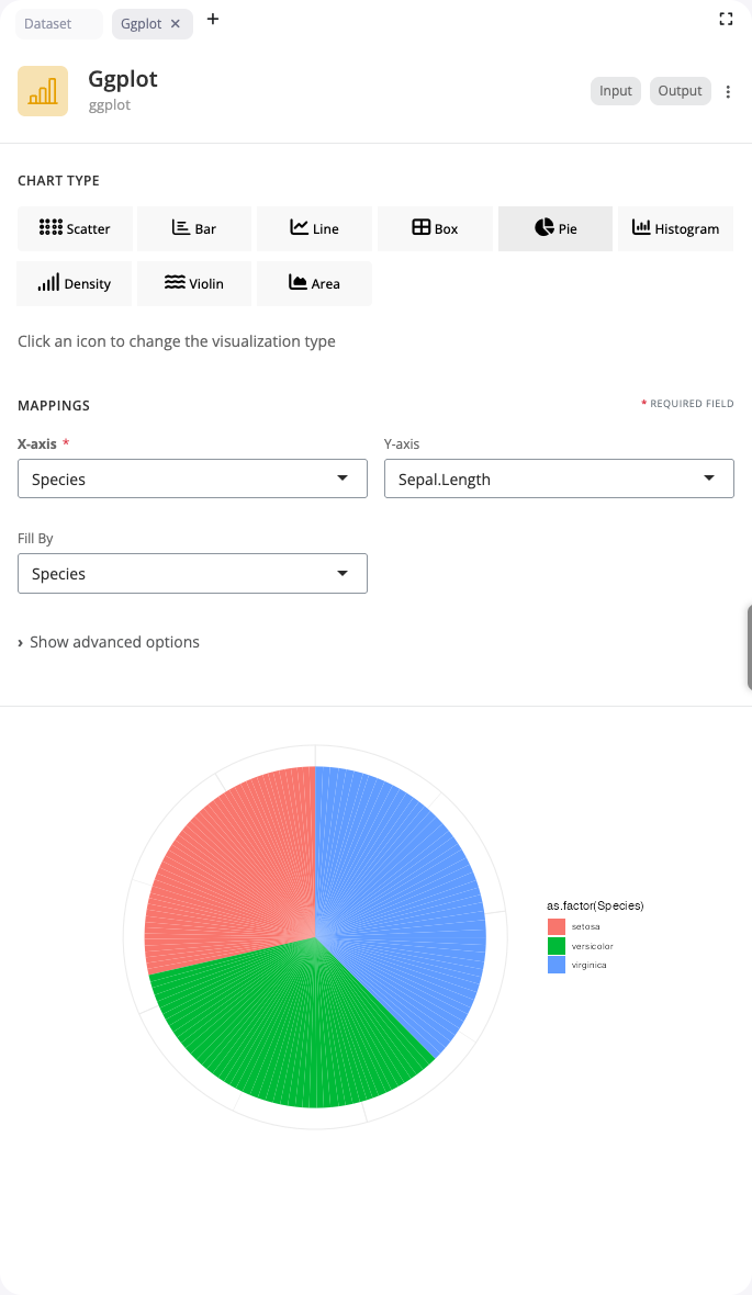
Pie Chart
Pie charts show proportions as slices of a circle. Use the “pie” chart type to display part-to-whole relationships for categorical data.
Map a categorical variable to x and a numeric value to y. Each category becomes a slice, with slice size proportional to its value. The fill aesthetic colors slices by category, automatically creating a legend. Pie charts work best with a small number of categories (3-7) where relative sizes are easy to compare.
While controversial among data visualization experts who prefer bar charts for precise comparisons, pie charts remain intuitive for showing simple proportions, especially when one category dominates or when emphasizing that parts constitute a whole. Keep categories limited and consider using a donut chart variant for a modern aesthetic.
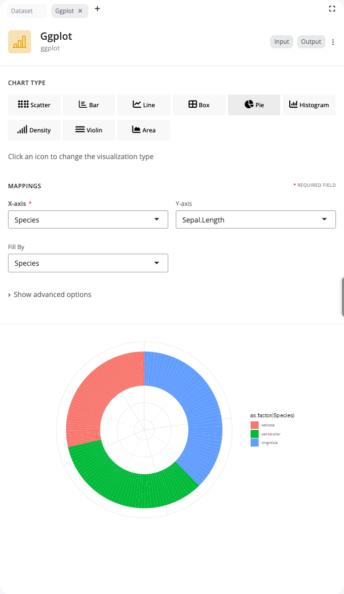
Donut Chart
Donut charts are pie charts with a center hole, offering a modern aesthetic and space for annotations. Use the “pie” chart type with the donut_hole parameter to create this variant.
Configure exactly like pie charts, but set donut_hole to a value between 0.3 and 0.7 to control the inner radius. The hole creates negative space that can reduce visual clutter and provides room for central labels or summary statistics. Donut charts are often considered more visually appealing than standard pie charts while conveying the same information.
The empty center draws attention and can be used strategically to display total values, titles, or key metrics. The ring shape also makes it slightly easier to compare arc lengths than full pie slices, as the curves are more linear. Use donut charts when aesthetics matter or when you want to emphasize the ring pattern over the center point.
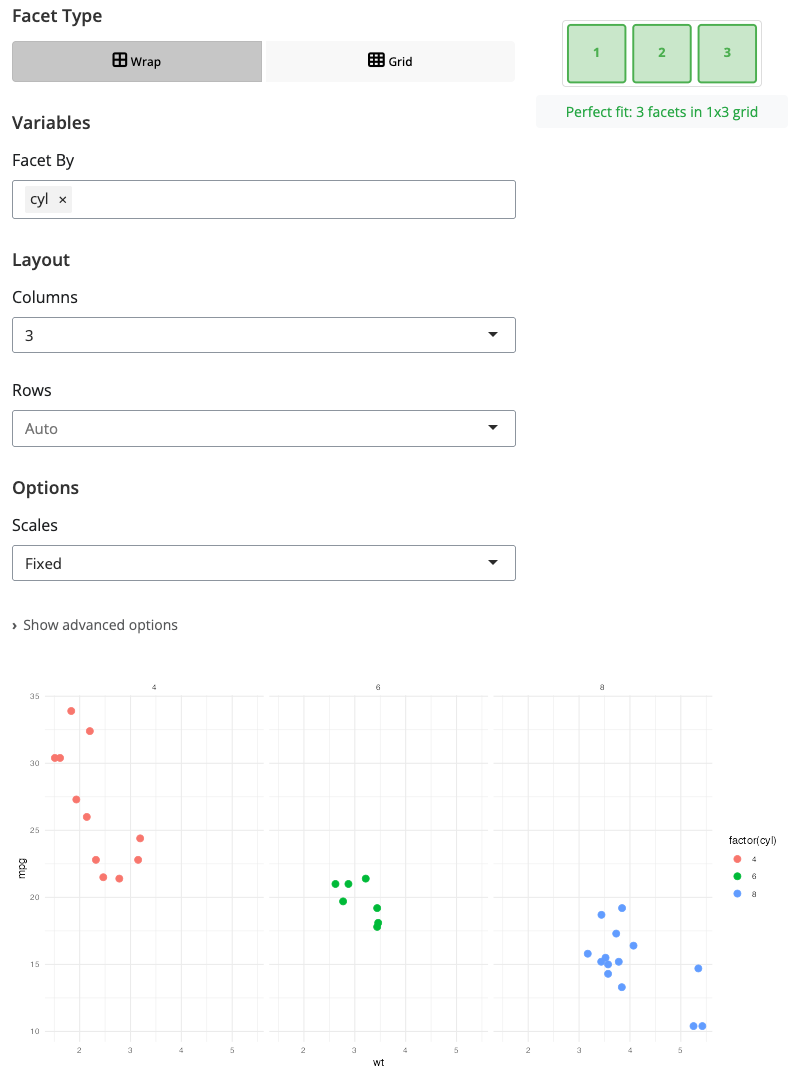
Facet: Wrap Layout
The facet block splits plots into multiple panels based on categorical variables. Use “wrap” mode for flexible grid layouts that flow naturally across rows.
Select a facet variable to create a separate panel for each unique value. The ncol parameter controls how many columns to use - facets fill columns left-to-right, then wrap to new rows. This is ideal when you have many facet levels or want automatic layout that adapts to available space.
Facet wrap works well with 3-15 groups where you want to see each group’s pattern separately while maintaining visual comparison. It automatically handles scales: by default all facets share the same x and y scales for easy comparison, though you can set scales to “free” for independent axes. Use this for comparing patterns across time periods, regions, or categories.
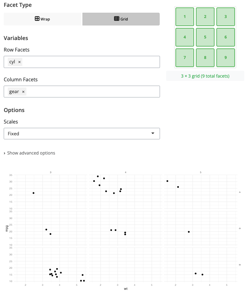
Facet: Grid Layout
Facet grid creates a matrix of panels based on two categorical variables - one for rows and one for columns. Use “grid” mode when you want to examine combinations of two factors.
Select variables for facet_rows and facet_cols to create a rows × columns layout. Each cell in the grid shows the intersection of one row category with one column category. This structured layout makes it easy to see how patterns vary across both dimensions simultaneously.
Facet grid is powerful for experimental designs with multiple factors, comparing subgroups across time periods, or any situation where data is naturally organized by two categorical variables. The grid structure reveals interaction effects and makes systematic comparisons straightforward. Keep factor levels reasonable (typically 2-5 levels per dimension) to maintain readability.
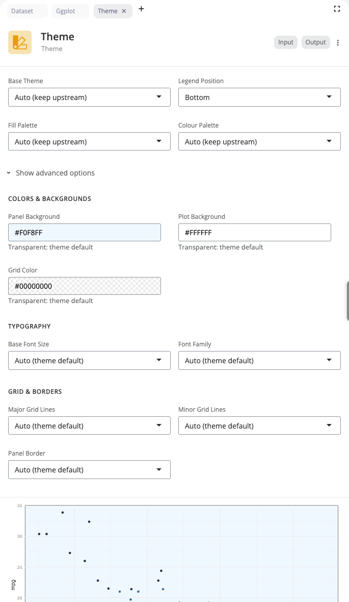
Theme Block
The theme block applies pre-defined styling to plots. Use themes to quickly change the overall appearance of visualizations without adjusting individual elements.
Select from over 20 built-in themes including classic ggplot2 themes (theme_minimal, theme_classic, theme_bw) and themes from extension packages like ggthemes. Each theme provides a coherent visual style with coordinated choices for backgrounds, grids, fonts, and colors.
Themes control non-data elements: backgrounds, grid lines, axis styling, legend appearance, and text formatting. Apply a theme block after visualization blocks to style the entire plot consistently. Common choices include theme_minimal for clean presentations, theme_classic for publication-ready plots, and theme_dark for emphasis or presentations on dark backgrounds.
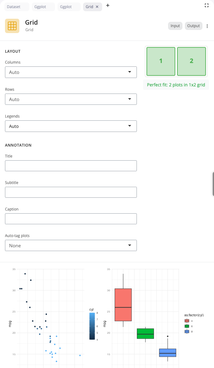
Grid Block
The grid block composes multiple plots into a single figure using patchwork. Use this to create publication-ready figures combining related visualizations.
Select a layout style (horizontal, vertical, or grid) and specify the number of plots. The block automatically arranges connected plots according to your layout choice. Horizontal layouts place plots side-by-side for comparing across categories. Vertical layouts stack plots for showing different aspects of the same data. Grid layouts create matrices for comprehensive multi-panel figures.
Grid composition is essential for complex figures that tell a complete story through multiple related views. Each input can be a complete visualization pipeline, allowing you to combine different chart types, subsets, or transformations. This is particularly powerful for academic papers, reports, or dashboards where you need to present multiple coordinated views.
Building Visualization Pipelines
Blocks work together in pipelines. Connect data transformation blocks (from blockr.dplyr) to visualization blocks to create end-to-end analysis workflows. The output from each block becomes the input to the next. Each block shows a preview at that stage, making it easy to understand how data flows through your pipeline.