Introduction to blockr for users
David Granjon (cynkra GmbH), Karma Tarap (BMS) and John Coene (The Y Company)
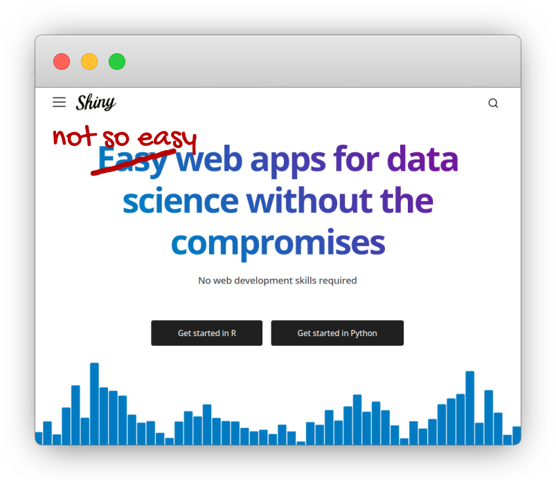
Developing enterprise-grade dashboards isn’t easy
Commercial solutions


- License cost 💲💲💲.
- Not R specific.
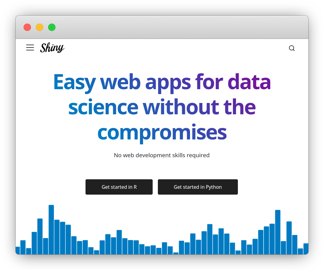
💡 Introducing {blockr}
“Shiny’s WordPress” (John Coene, 2024)
![]()
- Supermarket for data analysis with R.
- No-Code dashboard builder …
- … Extendable by developers.
- Collaborative tool.
- Reproducible code.
blockr 101
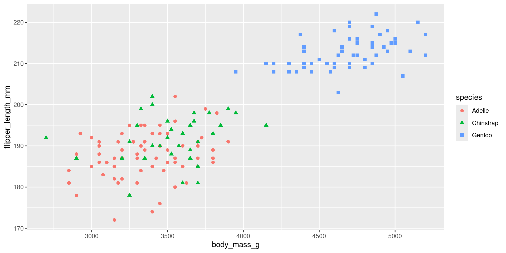
Problem: palmer penguins plot
What penguin species has the largest flippers?
- How can I produce this plot?
The stack: a data analysis recipe
Collection of instructions, blocks, from data import to wrangling/visualization.
Zoom on blocks: processing units
- Blocks categories: import (data), transform data, visualize, …
- Provided by developers (or us).
Example: transform blocks
flowchart TD
  blk_data_in(Input data)
  blk_data_out[Output]
  subgraph blk_block[Transform block]
    blk_field1(Field 1)
    blk_field2(Field 2)
    blk_field1 --> |interactivity| blk_expr
    blk_field2 --> |interactivity| blk_expr
    blk_expr(Expression)
    blk_res(result)
    blk_expr --> |evaluate| blk_res
  end
  blk_data_in --> blk_block --> blk_data_out
A transform block:
- Takes input data.
- Exposes interactive input to transform the data (select column, filter rows, …).
- Returns the transformed data.
🧪 Exercise 1
Instructions:
- Click on the
+button (top right corner). - Add a
palmer_penguinsblock. You may search in the list. - Add a new
filter_block, selectingsexas column andfemaleas value. Click onrun. - Add a new
ggplot_block. Selectxandywizely. - Add a new
geompoint_block. You may changeshapeandcolor. - You can remove and re-add blocks as you like …
- Export the stack code and try to run it.
How much code would it take with Shiny?
library(shiny)
library(bslib)
library(ggplot2)
library(palmerpenguins)

shinyApp(
  ui = page_fluid(
    layout_sidebar(
      sidebar = sidebar(
        radioButtons("sex", "Sex", unique(penguins$sex), "female"),
        selectInput(
          "xvar",
          "X var",
          colnames(dplyr::select(penguins, where(is.numeric))),
          "body_mass_g"
        ),
        selectInput(
          "yvar",
          "Y var",
          colnames(dplyr::select(penguins, where(is.numeric))),
          "flipper_length_mm"
        ),
        selectInput(
          "color",
          "Color and shape",
          colnames(dplyr::select(penguins, where(is.factor))),
          "species"
        )
      ),
      plotOutput("plot")
    )
  ),
  server = function(input, output, session) {
    output$plot <- renderPlot({
      penguins |>
        filter(sex == !!input$sex) |>
        ggplot(aes(x = !!input$xvar, y = !!input$yvar)) +
        geom_point(aes(color = !!input$color, shape = !!input$color), size = 2)
    })
  }
)
Changing the data, you also need to change the entire hardcoded server logic!
It’s much easier with blockr
library(blockr)
1new_stack(
2  data_block = new_dataset_block("penguins", "palmerpenguins"),
  filter_block = new_filter_block("sex", "female"),
3  plot_block = new_ggplot_block("body_mass_g", "flipper_length_mm"),
4  layer_block = new_geompoint_block("species", "species")
)
5serve_stack(stack)- 1
- Create the stack.
- 2
- Import data.
- 3
- Create the plot.
- 4
- Add it a layer.
- 5
- Serve a Shiny app.
🧪 Exercise 2: with pharma data
Instructions: distribution of age in demo dataset
- Add a
customdata_blockwithdemoas selected dataset. - Add a
ggplot_blockwithxas func andAGEas default_columns. - Add a
geomhistogram_block(you can leave default settings). - Add a
labs_blockwithtitle = "Distribution of Age",x = "Age (Years),y = "Count"as settings. - Add a
theme_block. - Add a
scalefillbrewer_block.
Connecting stacks: towards a dinner party
The workspace
flowchart TD
  subgraph LR workspace[Workspace]
    subgraph stack1[Stack]
      direction LR
      subgraph input_block[Block 1]
        input(Data: dataset, browser, ...)
      end
      subgraph transform_block[Block 2]
        transform(Transform block: filter, select ...)
      end
      subgraph output_block[Block 3]
        output(Result/transform: plot, filter, ...)
      end
      input_block --> |data| transform_block --> |data| output_block
    end
    subgraph stack2[Stack 2]
      stack1_data[Stack 1 data] --> |data| transform2[Transform]
    end
    stack1 --> |data| stack2
    subgraph stackn[Stack n]
      stacki_data[Stack i data] --> |data| transformn[Transform] --> |data| Visualize
    end
    stack2 ---> |... data| stackn
  end
Collection of recipes (stacks) to build a dashboard.
🧪 Exercise 3: share data between stacks
Instructions:
- Click on
Add stack. - From the new stack: click on
+to add a newresult_block. - Add a new
filter_blockto stack 1, withsexas column andfemaleas value. - Notice how the result of the second stack changes.
- Add a new
ggplot_block. - Add a new
geom_point block.
How do I create a workspace?
🧪 Exercise 4: joining data
Click on
Add stack, then add it acustomdata_blockwithlabdata.Click on
Add stack.- Add a
customdata_blockwithdemodata. - Add a
join_blockwithStack = "lab_data",type = "inner",by = c("STUDYID", "USUBJID")
- Add a
🧪 Exercise 5: Hemoglobin by Visit plot
Consider the previous 2 stacks (lab data merged with demo data).
Click on
Add stack, then add aresult_block, targeting thehb_datastack:- Add a
ggplot_blockwithx = "VISIT"andy = "Mean"as aesthetics. - Add a
geompoint_blockwithfunc = c("color", "shape")anddefault_columns = c("ACTARM", "ACTARM"). - Add a
geomerrorbar_blockwithymin = ymin,ymax = ymaxandcolor = ACTARM. - Add a
geomline_blockwithgroup = ACTARMandcolor = ACTARM. - Add a
labs_blockwithtitle = "Mean and SD of Hemoglobin by Visit",x = "Visit Label"andy = "Hemoglobin (g/dL)". - Add a
theme_block, selecting whatever theme you like. - TBC…
- Add a
How far can I go with blockr?